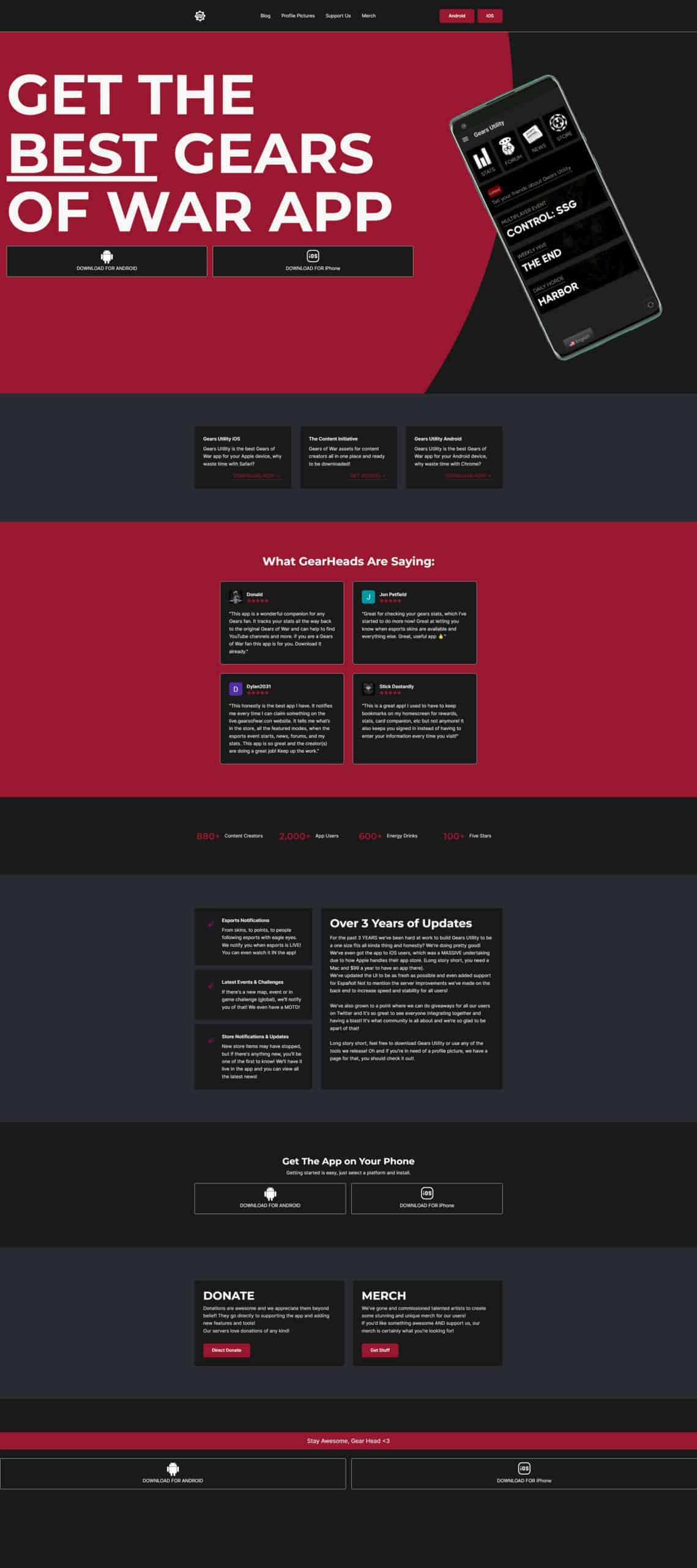
Gears Utility Website
Gears Utility’s website was a great experience to create. The website focuses on 3 main colours but there’s a consistent background colour where readable text is displayed. No matter the background, this colour is used to help with contrast.
Because the mobile mock-up is hovering based on CSS properties instead of a GIF (for example), less content is required to load, creating a fast, light and yet effective animation.
One challenge that we faced was profile pictures and the archive. These are dynamically set, meaning any image uploaded to a specific folder will upload to that specific image gallery tab. The archive part is also completely dynamic, at the click of a button a new archive can be created and shows to the front end immediately. Removing the need for style splicing or the need to learn any sort of editor. “It just works.” as they say.
All in all, it seems to be very well received! Which is what we strive for.

